




TJPI — Tae-Joon Park Institute — is formed of blocks that combine into one finished image. It is set in lower case, tjpi, for an institute that works with many knowledge networks, on the foundation of Park Tae-joon’s spirit, to look for answers for a better future society, and that means to lead that society through flexible research and an active response to change.
POSTECH Gray stands for the Institute’s firm resolve, founded on the spirit and leadership of Park Tae-joon; POSTECH Red for the passion behind its future-strategy research.
Colour guideline
| Colour | Process | RGB |
|---|---|---|
| POSTECH Red | C10 M100 Y30 K10 | R204 G0 B102 |
| Dark Gray | C60 M51 Y51 K20 | R102 G102 B102 |
| POSTECH Gray | C5 K60 | R102 G102 B92 |
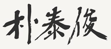
The founder’s signature
Park Tae-joon’s signature, and his own hand: 玉不琢不成器 — “jade uncut makes no vessel”. However fine a person’s nature, without learning and self-cultivation he cannot become a person of worth. The founding chairman wrote it himself, and it holds his philosophy of education.